Procedures
- Assets
- Components
- Edit Regions
- Images
- Insert a Link
- Login
- Logout
- Navigation
- Page Properties
- Publish | Submit
- Sections
- Snippets
- Template Sets
- Uploads
- Usability
Components are a form-based type of reusable content that simplify entering information into complex design elements. When a component is placed on a page, it acts as a form for you to enter information into. Then that information is placed in the source code of the component and added to the page.
Only Account Administrators (level 10) can access Components from Content, while other users can insert and edit or delete them from their pages.
Add Component
Go into the page where the component is to be placed, open the editable region immediately above it and place cursor exactly where it is to be placed:
Click "Insert Component" ![]() in the toolbar.
in the toolbar. 
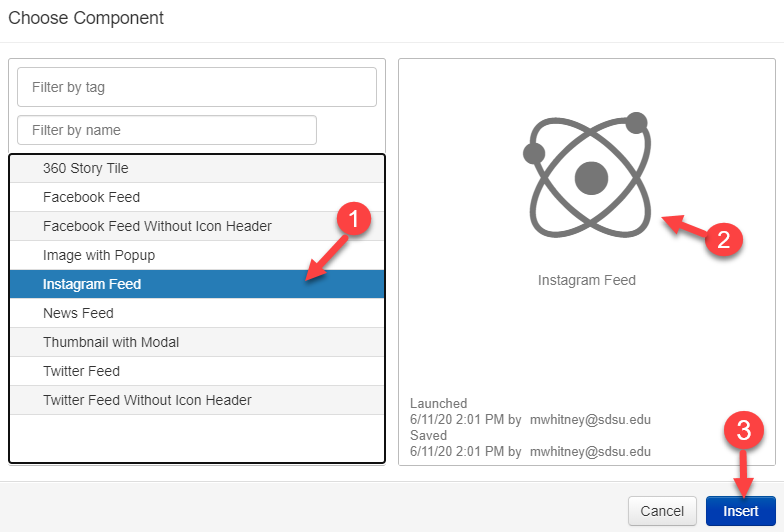
Choose the component you want, it will appear to the right, click Insert. 
Edit Component
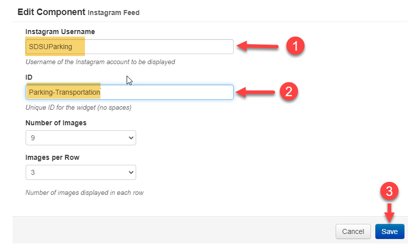
Fill out the blank component fields. Anything not marked optional is required, and must be filled out for the component to be placed on the page. * Below the component required the Instagram Username and ID. Click Save. The component is entered into the page with your answers.

Continue editing the page, or save and publish for your changes to appear on the live site.
Remove Component
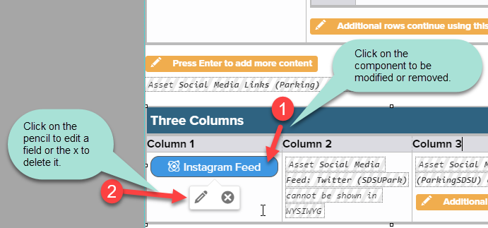
Click on a component to either edit the component answers (pencil icon) or delete it from the page ("x" icon).

When finished with all page edits, Save then Publish.
Administrators
When a component is inserted into the page, the source code shows the component ID, its version number, and the form content. The data entered into the component is stored in the page source code, not the component code.
The same component can be added to a page multiple times, with unique form content for each instance.
Manage
Content: Components shows a list of all components in the account. Components can be filtered by name and sorted by name, last modified and launch date. Only Level 10 users can access Content > Components.
Hover over a component for menu options:
- Preview: Preview, Versions, Log
- Edit*: Form Elements, Source, Component Settings, Access Settings
- File: Rename, View Dependents, Copy, Disable, Delete
- Launch*
*Only available if the component is checked-out.
Renaming a component is a simple action. Unlike a file, a component has no published URL and pages link to it using its component tag, so renaming a component does not affect any other files.
The View Dependents box shows all pages that a component has been placed on, including which sites the pages are on. Click on the page name to navigate to it.
Copying a component creates a duplicate of it. Edit the component name so it is not the same as the original component, and choose the target site (that it will be locked to should you choose so).
Disabling a component makes it unavailable to users placing a component on pages but does not remove it from any pages it is currently on. Enabling a component makes it available to place on pages. Unlike a launch, this does not update the component content.
Deleting a component removes it from all pages and permanently deletes it from OU Campus, and cannot be undone. Any pages affected by this are listed in the Required Actions report.
Review
Previewing a component shows you the form elements and the source code side-by-side, but does not add any content or styling. Preview a component via either:
In Content > Components, hover over the component and select Preview > Preview.
While viewing a component, select "Preview" from the top toolbar.
The component log shows each time a component is saved, launched, or renamed, and by which user. See the component log via either:
From Content / Components: hover over the component and select Preview, then Log.
While viewing a component, select "Properties" from the top toolbar and then Log
from the left menu.
Note: Component content cannot be searched for using find and replace.