Snippet Portfolio
It is very important to set up Stale or Scheduled Reminders for web pages to automatically send prompts to the content owner to verify the content remains accurate over time. Especially if snippets are utilized with statistics or fees posted.
Change Layout of Page
These multicolumn options are available to change the layout of editable regions.
On a full-width or internal page any of these column options can transform how the
editable regions appears. The images are placeholders that can be replaced with plain
content and the content can be replaced with an image or links.
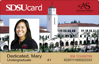
Design example combining Snippets, a Class and an Image together.
2 Column 25% / 75%
The important aspect of incorporating these layouts is to balance the content aesthetically. If the first inserted column snippet does not work best for the page, insert a different one that will then delete the previous option after copying the data.
2 Column 33% 67%
The important aspect of incorporating these layouts is to balance the content aesthetically. After inserting one of these column snippets on the page only to find out it does not work best for the page, try a different column snippet until the correct balance is struck then delete the previous option after the data is copied.
2 Column Layout 50% / 50%
2 Column 67% / 33%
The important aspect of incorporating these layouts is to balance the content aesthetically. After inserting one of these column snippets on the page only to find out it does not work best for the page, try a different column snippet until the correct balance is struck then delete the previous option after the data is copied.
2 Column 75% / 25%
The important aspect of incorporating these layouts is to balance the content aesthetically. If the first inserted column snippet does not work best for the page, insert a different one that will then delete the previous option after copying the data.
3 Column Layout
Design example of 3 Column with Images and Centered Content Class
4 Column Layout
One design example for using 4 column snippet layout.
6 Column Layout
Condense Content
These options are designed to chunk information and reduce the length of a web page by minimizing scrolling.
Accordion - modify the heading value accordingly on each web page (the default heading value is 4)
An accordion works by selecting a link which reveals more information below it. It is useful for hiding content that may not be of interest to them. The audience only sees details of the topics they select within the accordion.
FOR APPLICANTS NOT CURRENTLY EMPLOYED BY SDSU: Select "New & Returning Job Seekers". The Careers page will display all the open Staff positions with the University. Applicants can select any one job or multiple jobs that they are interested in by selecting the check box next to the job title(s). Once a job has been selected the applicant can scroll down to the bottom of the list and select on "Apply Now". If applicants have not already registered or logged in to their profile they will be prompted to do so at this time.
CURRENT EMPLOYEES: Select "Current Employees & Student Assistants, then select "Self Service" in the menu, then select "Careers". The Careers page will display all the open Staff positions with the University. Applicants can select any one job or multiple jobs that they are interested in by selecting the check box next to the job title(s). Once a job has been selected, scroll down to the bottom of the list and select "Apply Now".
If an applicant has entered an e-mail address in their profile, they can select “Login Help” on the Careers page and request that their User Name or Password be sent to their e-mail address.
If an email address has not been provided, a new User Name and Password must be created and all application materials must be recreated.
SDSU employees should contact the Business Information Systems Help Desk at ext. 4-0899 or use the “Forgot your password?” link on the log in page to request a new password.
Announcements
This snippet is useful to highlight information in a compact format. Top item appears by default with an arrow to move through other announcements.
Announcements
Open Enrollment Now Closed
The Benefits Open Enrollment period was from September 14, 2015 through October 9, 2015. Benefit elections and changes during Open Enrollment will take effect on January 1, 2016.
Open Enrollment Now Closed
The Benefits Open Enrollment period was from September 14, 2015 through October 9, 2015. Benefit elections and changes during Open Enrollment will take effect on January 1, 2016.
Tabs
Select the tab heading of interest and the associated information appears in the box below. It is a great method to streamline content in a neat format. The tab headings must be short to maintain its responsiveness when rendered on smaller devices. Design example of Tabs snippet used with Column snippets and Images.
When the first tab is selected this content opens here.
When the second tab is selected this content opens here.
When the third tab is selected, this content opens here.
When the fourth tab is selected, this content opens here.
Events/Event
To display multiple events, first insert the Events snippet then add additional Event snippets for each event.
EventsView
//Calendar
Benefits Orientation
ESC 403 (map to ESC-403)
Benefits Orientation
ESC 403 (map to ESC-403)
Social Media Links
Additional Social Media Links/Icons may be added or deleted from this snippet if they do not apply or are not included.
Design Elements
Buttons with color help draw attention to links. Consider the width of the editable region where buttons get inserted. This is where using the column snippets is useful based on how many links are being added. To decide which column snippet works best with the number of links being created also depends on how much text or the size of the image used in the opposing column.
Gray Button
Red Button
Image with Caption
These options are a matter of preference; either the caption is below the image or within the image.

Caption displays outside of image.
Image with Caption (Main)
Caption is located within the image.
Feature Box One Column
Feature boxes (one and two column) provide a beige background with red line down the left side of the box to draw attention to the content within it. It adds a different design element to a page. If the content looks better the full length of the editable region use 1 column. If a logo or image is beneficial along side the content, use the two column snippet.
Content
Feature Box Two Column
Content
Content
Emphasize Important Information
Utilize these snippets to make content pop on a page and lead the audience to more information on the topic or to highlight noteworthy statistics.
Content Flex Box
The SDSU WebPortal serves admission, enrollment, and registration needs across campus.
Blackboard focuses on technology and services to help students learn, not just one way, but their own way.
Find training that’s right for you.
Flex Box
Icon List
Link Icon
Icon List - Single Column
Feature Box List
View Your Benefits
- Log-in: PeopleSoft
- Click "Self Service"
- Click "Benefits"
- Click "Benefits Summary"
Split Boxes
Quick Facts
These snippets are to emphasize noteworthy information. Insert Quick Fact snippet on a page then replace the icons to represent the content shared and update the content to reflect department information. This snippet presents as seen below.
211,234Total Donors
74,135
53,196Million-Dollar Gifts
140
$302,000,000Legacy Gifts
$225,000,000
Collapsible Quick Fact Boxes
This Quick Fact information renders as boxes and new information appears below each box after the associated link is selected.
This is content displayed by the Total Gifts link.
This is content displayed by the Alumni Giving link.
This is content displayed by the Legacy Gifts link.
Note: A new snippet must be inserted if more than 3 boxes are desired.
Title Bar (e.g. paragraph headings)
Using a Title Bar for headings creates a clear break for each paragraph with an icon for a visual association.
Tool Kit
Directory Options
Select a directory standard based on where the persons information will reside; either below or to the right of their picture. Best practice is to choose one option and be consistent in the directory.
Directory

Directory Profile
Provide profile here about the individual.
Define Words
Definition List
- Word or phrase
-
Definition